
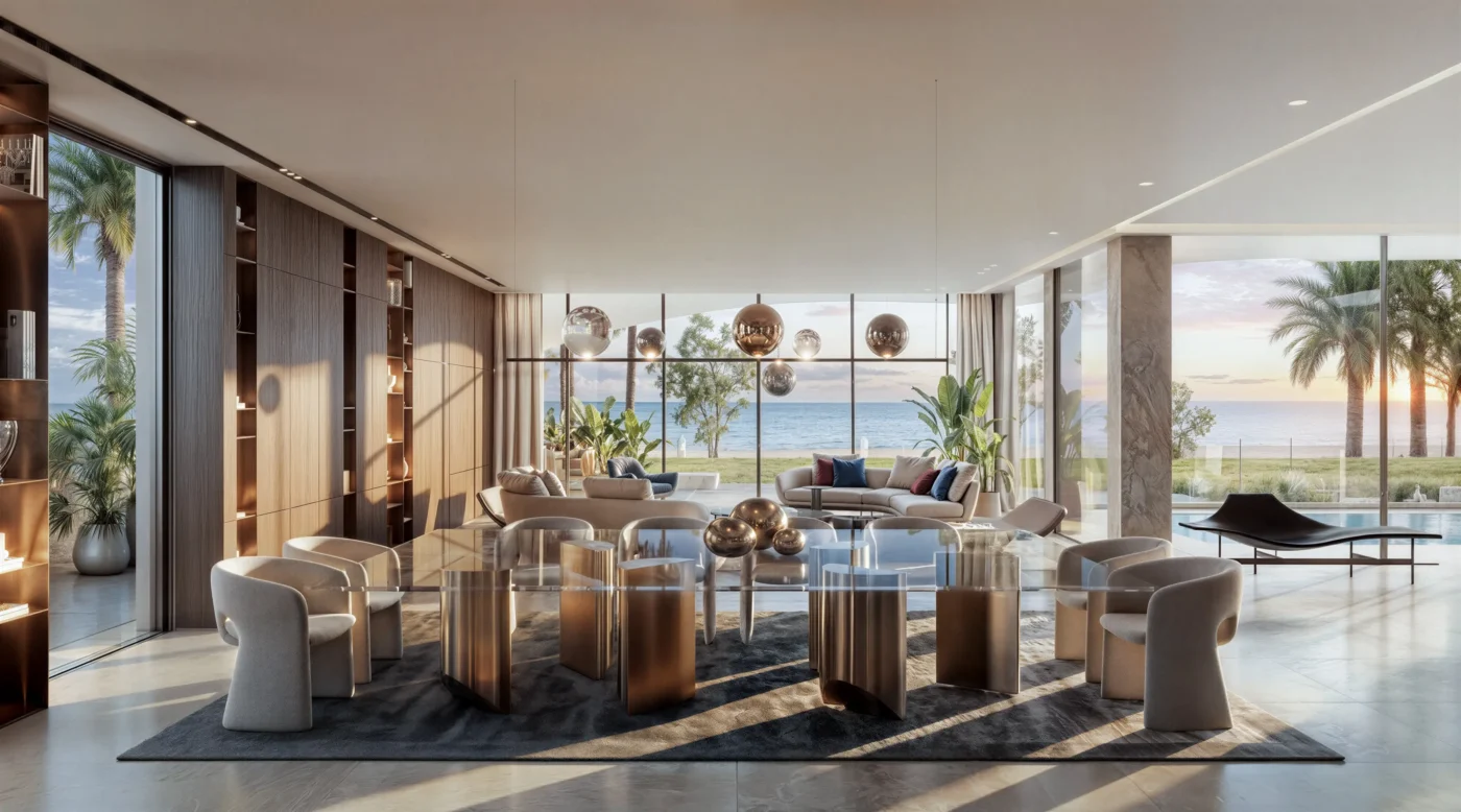
Here’s something nobody tells you when you start out doing interior renders. Clients almost never comment on the thing you spent the most time on. You’ll spend four hours getting a bookshelf’s material IDs exactly right, and they’ll say nothing. You’ll spend twenty minutes warming up the lighting in one corner, and that’s the note you get back: “I love this, it feels so cozy.” After a while you stop being offended by it and start paying attention to what’s actually happening.
Materials do more talking than you'd expect
Table of Contents
You learn pretty fast that clients can’t tell you what’s wrong with a bad material, but they know something’s wrong. Show someone a synthetic-looking marble countertop and they won’t say “the specular highlight is too uniform.” They’ll just say the room “looks a little cheap” or “feels off,” and they’re right, they just don’t have the vocabulary for why. This is the first thing worth getting genuinely good at, not because it’s flashy, but because it’s the thing that quietly earns or loses trust before anyone’s looked at the furniture layout.
A neat trick that serves well for such scenarios is, don’t just get the material right, get its imperfection right. Real stone has variation. Real wood has grain that isn’t perfectly repeating. Real fabric catches light unevenly depending on the weave. Perfectly uniform materials are actually the tell that something’s synthetic, so a little intentional irregularity usually reads as more convincing than technical perfection does.
Lighting sets the mood before anyone's looked at a single piece of furniture
This one takes longer to internalize than it should have. You can nail every proportion in a room, get every piece of furniture exactly where the floor plan says it should go, and still have a client shrug at the image if the lighting is flat and even. Flat light is honest, technically. It’s also emotionally nothing.
What actually works, more often than not, is lighting that isn’t perfectly balanced. A lamp glow in one corner that doesn’t reach the far wall. Natural light raking across a surface at an angle that creates real shadow, not just illumination. A little bit of falloff toward the edges of a frame. None of this is about accuracy anymore, it’s about mood, and mood is what a client responds to in the first half-second before they’ve consciously registered anything else in the room.
Get proportions right before you touch styling, every time
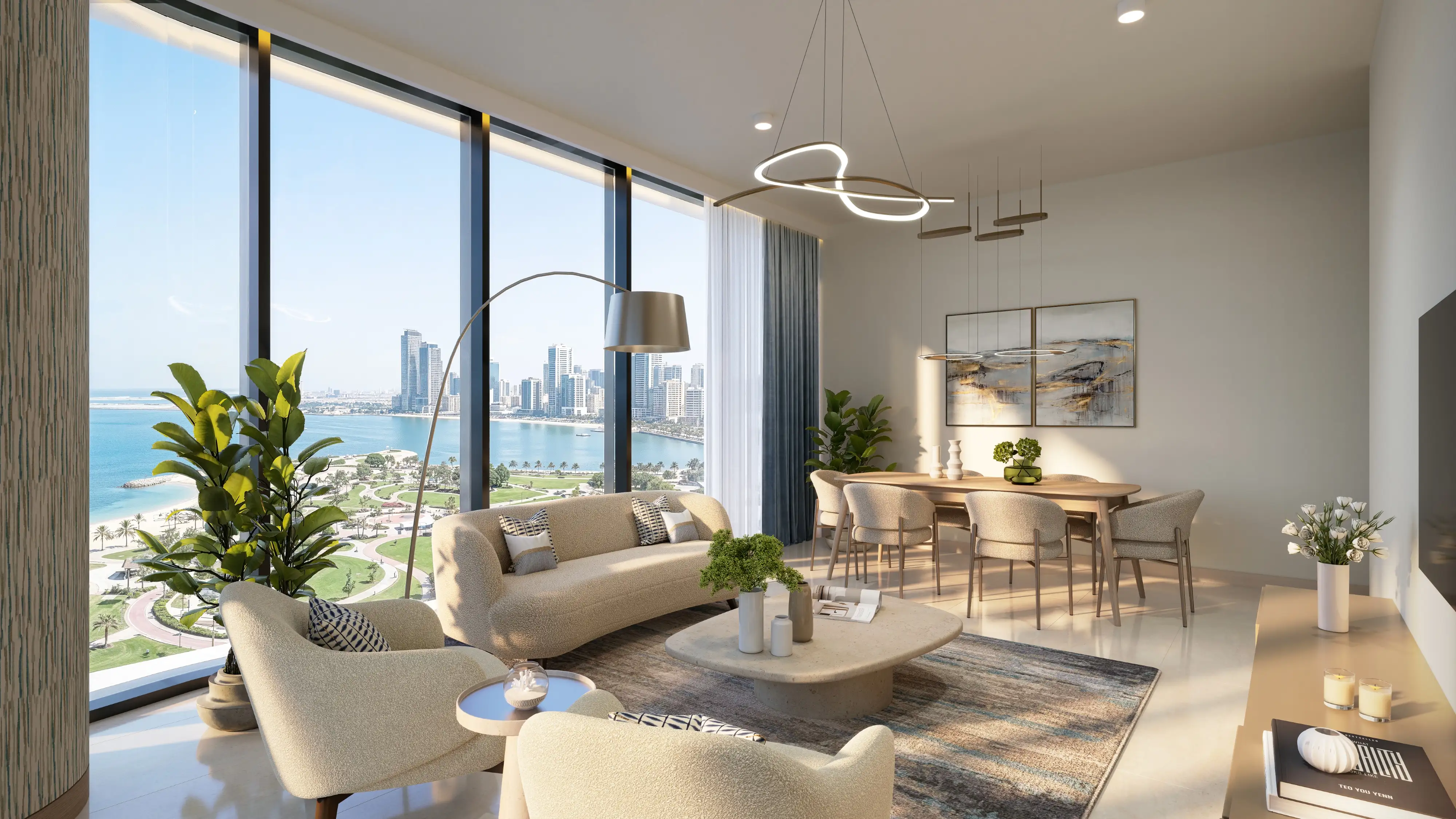
This is the boring one, but it’s foundational, and many times a render may fail because someone skipped straight to styling before locking this down. A slightly oversized console table might not jump out at you on a still image, especially if you’re the one who’s been staring at the scene for six hours. Put a client into an interactive walkthrough with that same table, though, and they’ll feel it immediately, even if they can’t say what’s wrong. Something about the scale will read as uncanny, the way a room feels wrong in a dream even when you can’t point to why.
The fix is unglamorous. Check proportions early, check them again before styling, and don’t let a beautiful prop distract you from a table that’s five percent too big.
One good hero shot beats five decent ones
If there’s a single habit worth changing, it’s this. A lot of effort goes into producing a full set of angles for a room, and most of that effort is invisible to the client, because they usually only really look closely at one image. The one on the thumbnail. The one at the top of the deck. That’s the shot doing the actual work of impressing someone, and it deserves more attention than it usually gets.
A hero shot earns its keep with a slight diagonal instead of a flat frontal angle, something in the foreground to create depth, and one clear focal point the eye lands on immediately rather than a room with five things competing for attention. Spend the extra hour on that one frame. It’s worth more than an extra angle nobody will really study.
Less styling, more often than not, reads better
It’s tempting to fill every surface, because an empty surface can feel unfinished. In practice, an overstyled room often reads as staged rather than lived-in, which undercuts the exact feeling most interior renders are going for. A single open book, one plant, one piece of art angled slightly, these read as intentional. A room dressed within an inch of its life reads as a showroom, and clients can usually tell the difference even if they can’t articulate it.
What this all adds up to
None of these are complicated techniques. They’re mostly about where the effort actually pays off versus where it just feels productive. Materials and lighting do more emotional work than clients will ever mention out loud. Proportions have to be right before anything else matters. One hero shot carries more weight than a full set of competent angles. And restraint, more often than people expect, beats abundance.
The render that impresses a client instantly is rarely the most technically ambitious one in the folder. It’s usually the one that got these five things right and didn’t try to do much else.
FAQ’s
Do clients actually notice technical rendering quality, or just the overall feel of a space?
Mostly the overall feel. Clients rarely comment on technical precision directly, but they’re highly sensitive to whether materials and lighting feel convincing, even without the vocabulary to explain why something looks off.
Why does lighting matter more than furniture choice for a first impression?
Lighting sets the emotional tone of a scene before a viewer has consciously processed any individual object in the room. A well-lit, simply furnished room often reads better than a flatly lit, elaborately furnished one.
Is more styling always better in an interior render?
No. Overstyled scenes can read as staged rather than lived-in. A few purposeful objects usually create a stronger sense of an actual life happening in the space than a fully dressed surface does.
How important is the hero shot compared to the full set of angles?
Very important, often disproportionately so. Clients typically form their first impression from a single image, usually a thumbnail or the top slide in a deck, so that one frame deserves more attention than an even spread across every angle.
Can proportion errors be fixed after a scene is already styled?
It’s possible, but it’s more work than getting it right early. Restyling around a corrected proportion often means redoing prop placement too, so checking scale before adding styling saves time in the long run.

